
Appearance
BFC
Floats, absolutely positioned elements, block containers (such as inline-blocks, table-cells, and table-captions) that are not block boxes, and block boxes with 'overflow' other than 'visible' (except when that value has been propagated to the viewport) establish new block formatting contexts for their contents.
浮动,绝对定位的元素,不是块级元素的块容器(例如 inline-blocks ,table-cells 和 table-captions)及块级元素的 overflow 属性不是 visible 的,会创建一个新的块级上下文为它们的内容
In a block formatting context, boxes are laid out one after the other, vertically, beginning at the top of a containing block. The vertical distance between two sibling boxes is determined by the 'margin' properties. Vertical margins between adjacent block-level boxes in a block formatting context collapse.
在块级格式化上下文中,盒子的布局是一个接着一个垂直的排列,从包含块的顶部开始,两个同级盒子之间,垂直距离由 margin 属性决定。在块级格式化上下文中,相邻的块级盒子的垂直外边距会折叠
In a block formatting context, each box's left outer edge touches the left edge of the containing block (for right-to-left formatting, right edges touch). This is true even in the presence of floats (although a box's line boxes may shrink due to the floats), unless the box establishes a new block formatting context (in which case the box itself may become narrower due to the floats).
在 BFC 中,每个盒子的左外边缘接触包含块的左边缘(对从右到左的的格式,右边缘接触),即使有浮动的情况下也是如此(尽管盒子的行盒可能因为浮动而缩小),除非这个盒子建立一个新的 BFC(在这种情况下盒子自身可能因为浮动而变窄)
BFC 是一个独立的渲染区域,可以把 BFC 理解成一个封闭的容器,内部的元素无论怎么变动都不会影响外部元素
- 就是一个块级元素,块级元素会在垂直方向一个接着一个排列
- 页面中一个隔离独立容器,容器内部的标签不会影响到外部标签
- 容器不会与浮动的窗口发生重叠
- 属于同一个 BFC 的两个相邻元素外边距可能会发生折叠,垂直方向的距离由两个元素中 margin 较大的值决定
- 计算 BFC 高度时浮动元素也会参与计算
可以解决的问题
- 可以阻止元素被浮动元素覆盖 两栏布局
- 能够解决,子元素设置浮动,父元素高度塌陷的问题 触发 bfc 后父元素的高度会被撑开,也是就是说会产生清除浮动的效果
- 可以解决 margin 边距合并的问题
包含块
一个元素的尺寸和位置经常受包含块(containing block)的影响,大多数情况下,包含块(标准盒模型)就是这个元素最近的祖先块元素的内容区。 当我们对元素的尺寸和位置(margin || padding || width || height || left || right || top || bottom) 使用 percentage values 时,这些值的计算值,是通过元素的包含块计算得来的。其中 height || top || bottom 由包含块的 height 决定
包含块的确定完全依赖这个元素的 position 属性:
- 当
position属性为static || relative || sticky, 其包含块最近的祖先块元素的 content area 的边缘组成或者最近的 BFC - 当
position属性为absolute时,其包含块为(!static)的最近的祖先元素 padding area 的边缘组成WARNING
如未显式指定,则为初始包含块
viewport(MDN 对此并未说明)chrome 浏览器当显式的设置包含块为 body 时, 其为 border area , firefox 则正常
根元素(
html)所在的包含块是一个被称为初始包含块的矩形,它的尺寸是视口,可通过innnerWidth innerHeight获取
- 当
position属性为fixed时,其包含块通常为viewport - 当
position属性为absolute || fixed时,包含块也可能是由满足以下条件的最近父级元素的内边距区的边缘组成的:- transform 或 perspective 的值不是 none
- will-change 的值是 transform 或 perspective
- filter 的值不是 none 或 will-change 的值是 filter(只在 Firefox 下生效)。
- contain 的值是 paint(例如:contain: paint;)
- backdrop-filter 的值不是 none(例如:backdrop-filter: blur(10px);)
offset client scroll 系列
TIP
margin || padding || left || top percentage values 是相对于带有定位的最近祖先元素(不一定是父级元素)
offsetLeft || offsetTop 返回当前元素相对于 offsetParent 节点的 左边 || 顶部 偏移的像素值
MDN 上对此解释并不太精准,实际应该是到包含块的 左边 || 顶部 偏移值。总之:如未显式指定 position 属性值为,那么偏移值就是到视口的距离。
若 transform 参与位移, offsetTop offsetLeft 获取的值并不可靠
getBoundingClientRect 可获取相对于视口的位置
上述可参考containing block
js
// 盒模型,默认 margin border padding  content 可能还会有 scrollBar(chrome scrollBarWidth 默认为17)

const outer = document.querySelector('.outer');

/**
 * offset left | top 距离包含块的偏移量
 * offset width | height 包含 border padding content scrollbar
 *
 * client width | height 不包含 border scrollbar
 * client top | left border-top | border-left 宽度
 *
 * scroll width | height 不包含 border scrollbar
 * scrollTop = scrollHeight - clientHeight
 * scrollLeft = scrollHeight - clientWidth
 */

console.log(
  JSON.stringify({
    left: outer.offsetLeft,
    top: outer.offsetTop,
    width: outer.offsetWidth,
    height: outer.offsetWidth,
    clientWidth: outer.clientWidth,
    clientHeight: outer.clientHeight,
    borderTop: outer.clientTop,
    borderLeft: outer.clientLeft,
    scrollWidth: outer.scrollWidth,
    scrollHeight: outer.scrollHeight
  })
);

outer.addEventListener('scroll', e => {
  console.log({ scrollTop: e.target.scrollTop, scrollLeft: e.target.scrollLeft });
});line-height 与 vertical-align
line-heightpercentage || length ==> 行盒的高度 = font-size(继承) * value无单位数值 ==> 行盒的高度 = fontsize(自身) * number
x-height是指字母的基本高度,精确的说就是基线(basheline)和主线(mean line又称中线median)之间的距离
ascender是指超过主线笔画的部分,也就是比x-height还要高的部分
descender是指字母向下延伸超过基线的笔画部分,也称为下延部
cap height是指位于基线以上的大写字母的高度
vertical-align: middle指的是基线往上 1/2"x-height"高度。我们可以近似脑补成字母x交叉点那个位置。 跟median不是一个意思。

html
<style>
    .parent {
      background-color: #f0f0f0;
      line-height: 1.5;
    }

    .son {
      border: 1px solid blue;
      font-size: 40px;
    }
  </style>
</head>

<body>
  <div class="parent">
    我是父级元素,我的font-size为16px,line-height为150%
    <div class="son">
      我是子级元素,我的font-size为40px,继承line-height为150%
      我是子级元素,我的font-size为40px,继承line-height为150%
      我是子级元素,我的font-size为40px,继承line-height为150%
      我是子级元素,我的font-size为40px,继承line-height为150%
    </div>
  </div>
</body>布局相关
浮动
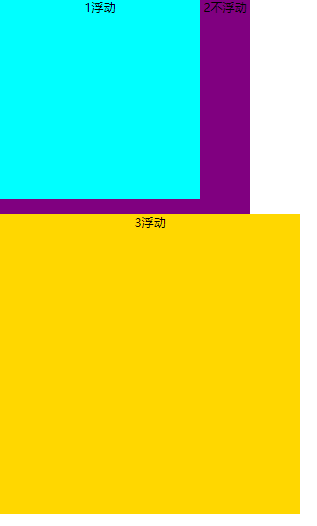
- 浮动元素脱离标准流
- 浮动元素一行显示,除非一行显示不了,才进行换行
- 添加了浮动后,浮动元素具有行内块特性(也就意味着如果不给宽度,元素的宽度由其内容的宽度决定) 浮动只会影响后续盒子排列,如果后面的盒子有浮动,不能压到前面浮动的盒子,如果不浮动,后面浮动的例子不能小于其高度
- 第二个盒子高度 < 第一个盒子高度
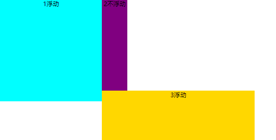
- 第二个盒子高度 >= 第一个盒子时高度
- 清除浮动
原因:由于父盒子不便给高度,子盒子浮动后,后面的盒子会跑上去。
- 额外标签法 clear:both 在浮动盒子的后面添加一个盒子
html
<!DOCTYPE html>
<html lang="en">
  <head>
    <meta charset="UTF-8" />
    <title>Document</title>
    <style>
      .box1 {
        width: 500px;
        background-color: pink;
      }
      .son1 {
        width: 150px;
        height: 200px;
        background-color: skyblue;
        float: left;
      }
      .son2 {
        width: 150px;
        height: 200px;
        background-color: gray;
        float: left;
      }
      .box2 {
        width: 500px;
        height: 400px;
        background-color: purple;
      }
      .clear {
        clear: both;
      }
    </style>
  </head>
  <body>
    <div class="box1">
      <div class="son1"></div>
      <div class="son2"></div>
      <div class="clear"></div>
    </div>
    <div class="box2"></div>
  </body>
</html>- overflow: hidden;——父级添加 overflow: hidden 方法
- after 伪元素清除浮动——父级盒子添加.clearfix:after
css
.clearfix:after {
  content: '.';
  height: 0;
  display: block;
  visibility: hidden;
  clear: both;
}
.clearfix {
  *zoom: 1;
}- 双伪元素清除浮动
css
.clearfix:after,
.clearfix:before {
  content: '';
  display: table; /*触发bfc*/
}
.clearfix:after {
  clear: both;
}
.clearfix {
  *zoom: 1;
}定位
静态定位 static
默认值,正常文档流
相对定位 relative
原来的位置继续占有,每次移动以自己的左上角为基准点来移动
绝对定位 absolute
原来的位置不保留,以最近的带有定位的祖先元素(非 static)为基准点来移动
固定定位 fixed
相对于浏览器视窗进行定位
粘性定位 sticky
是相对定位和固定定位的混合。元素在跨越特定阈值前为相对定位,之后为固定定位
FLEX 布局
justify-content和align-content是控制 flex 项目(flex items)在 主轴 和 ”多条主轴“在交叉轴 的对齐方式,所以当主轴为水平时,交叉轴必须有多行align-content才会有效。反之同理!作用于 flex 容器(flex container)。[^1]
align-items和align-self是控制 多个 或 单个 flex 项目在交叉轴对齐方式,取值相同。由于其本身默认值为 stretch,所有只有当容器高度 大于项目总高度时,改变基才有效!交叉轴不管单行多行都有效,分别作用于 flex 容器(align-items) flex 项目(flex items)
css
.container {
  height: 400px;
  display: flex;
  flex-flow: row wrap;
  /* justify-content: space-between; */
  align-content: space-between;
}
.item {
  flex: 0 1 30%;
  height: 100px;
  background-color: purple;
}

/* 按照一行三个 当最后一个是3n-1时(2、5、7) 则给外边距 */
.item:last-child:nth-child(3n-1) {
  margin-right: calc(30% + 10% / 2);
}

/* 去掉父容器的 justify-content */
.item:not(:nth-child(3n)) {
  margin-right: calc(10% / 2);
}GRID 布局
作用于 grid 容器
grid-template-columns与grid-template-rows
html
<div class="container">
  <div class="item">你好啊</div>
</div>css
.container {
  width: 1200px;
  margin: auto;
  display: grid;

  /* <line-name> [row1] <track-size> 25% */
  grid-template-columns: [col1-start] 80px [col1-end col2-start] auto [col2-end col3-start] 100px [col3-end];
  grid-template-rows: [row1] 25% [row2] 100px [row3] 50px [row4] 60px [row5];

  /* 简写 */
  grid-template-columns: 80px auto 100px;
  grid-template-rows: 25% 100px 50px 60px;

  /* repeat */
  grid-template-columns: repeat(4, 300px);
  grid-template-rows: repeat(4, [row-start] 100px [row-end]);

  /* 1fr = 1200 / 4 = 300 */
  grid-template-columns: 1fr 1fr 2fr;
  grid-template-rows: repeat(4, 100px);

  /* 1fr = (1200 - 300) / 3 = 300 */
  grid-template-columns: 300px 1fr 2fr;
  grid-template-rows: repeat(4, 100px);

  /* 如果为auto 即内容宽度 假设内容宽度为48 则 1fr = (1200-48)/3=384 */
  grid-template-columns: auto 1fr 2fr;
  grid-template-rows: repeat(4, 100px);

  /* 0.25fr = (1200-48)*0.25 = 288  auto = 1200 - (288 *3) = 336px */
  grid-template-columns: auto 0.25fr 0.25fr 0.25fr;
  grid-template-rows: repeat(4, 100px);
}- xxxxxxxxxx js
html
<style>
  .container {
    margin: 0 auto;
    width: 1200px;
    height: 600px;
    display: grid;

    grid-template-columns: 1fr 1fr 1fr;
    grid-template-rows: repeat(4, 1fr);
    /* grid-template-areas 会自动添加 <linename> */
    grid-template-areas:
      '葡萄 葡萄 葡萄'
      '龙虾 养鱼 养鱼'
      '龙虾 养鱼 养鱼'
      '西瓜 西瓜 西瓜';
  }

  .putao {
    grid-area: 葡萄;
  }
  .longxia {
    grid-area: 龙虾;
  }
  .yangyu {
    grid-area: 养鱼;
  }
  .xigua {
    grid-area: 西瓜;
  }
</style>

<div class="container">
  <div class="putao">葡萄种植区</div>
  <div class="longxia">龙虾养殖区</div>
  <div class="yangyu">鱼类养殖区</div>
  <div class="xigua">西瓜种植区</div>
</div>grid-template
grid-template是grid-template-rows,grid-template-columns和grid-template-areas属性的缩写
css
/* html 同上 */
.container {
  margin: 0 auto;
  width: 1200px;
  height: 600px;
  display: grid;

  /* 4行3列 <grid-template-rows> / <grid-template-columns> */
  grid-template:
    '葡萄 葡萄 葡萄' 1fr
    '龙虾 养鱼 养鱼' 1fr
    '龙虾 养鱼 养鱼' 1fr
    '西瓜 西瓜 西瓜' 1fr
    /1fr 1fr 1fr;
}

.putao {
  grid-area: 葡萄;
}
.longxia {
  grid-area: 龙虾;
}
.yangyu {
  grid-area: 养鱼;
}
.xigua {
  grid-area: 西瓜;
}grid-column-gap与grid-row-gap
html
<style>
  .container {
    margin: 0 auto;
    width: 1200px;
    height: 600px;
    display: grid;

    /* <grid-template-rows> / <grid-template-columns> */
    grid-template: 1fr 2fr/ 2fr 1fr;

    /* 过时的写法 */
    /* grid-row-gap: 16px;
        grid-column-gap: 8px; */

    /* 推荐的写法 */
    /* row-gap: 16px;
        column-gap: 8px; */

    /* 过时的简写 <grid-row-gap> / <grid-column-gap> */
    /* grid-gap: 16px 8px; */

    /* 推荐的写法 */
    gap: 16px 8px;
  }
</style>

<div class="container"></div>- 对齐方式
html
<style>
  .container {
    margin: 0 auto;
    width: 400px;
    height: 400px;
    display: grid;
    grid-template: 100px 100px 100px / 100px 100px 100px;
    /* gap: 10px; */

    /* align-items justify-items  默认值 stretch  相对于单元格(Grid cell)的位置 */
    /* align-items: center; */
    /* justify-items: center; */

    /* 简写 <align-items> <justify-items> */
    place-items: stretch;

    /* align-content justify-content 默认值 stretch 相对于 水平(inline/row axis) 垂直(block/column axis) 的对齐方式 */
    /* align-content: space-between;
        justify-content: space-between; */

    /* place-content: space-between; */
  }

  .container > div {
    background-color: teal;
  }
</style>

<div class="container">
  <div class="item1">item1</div>
  <div class="item2">item2</div>
  <div class="item3">item3</div>
  <div class="item4">item4</div>
  <div class="item5">item5</div>
  <div class="item6">item6</div>
  <div class="item7">item7</div>
  <div class="item8">item8</div>
  <div class="item9">item9</div>
</div>作用于 gird 子项
[^1]: grid 布局中 place-content 是 align-content 与 justify-content的复合写法。 place-items 是 align-items justify-items 的复合写法。flex 布局中都可以使用
CSS 属性相关
font
rem 相对于根元素(即 html 元素 默认为 16px )、 em 相对于父元素
background
属性简写: background: color image position/size origin clip repeat
background-attachment默认值:scroll背景相对元素本身是固定的(即使元素是滚动的)local相对于元素的内容(文字)固定(overflow: auto)fixed相对于视口(可视区域)固定,background-position 也是相对于可视区域了(所以 center 可能看不见)xxxxxxxxxx /** @see {@link https://leetcode.cn/problems/Gu0c2T/description/ | LCR 089. 打家劫舍} * @param {number[]} nums * @returns {number} /function rob(nums = [1, 2, 3, 1]) { const dp = Array(nums.length).fill(0); dp[0] = nums[0]; dp[1] = Math.max(nums[0], nums[1]); for (let i = 2; i < nums.length; i++) { dp[i] = Math.max(dp[i - 2] + nums[i], dp[i - 1]); } return dp.at(-1);}/ * @see {@link https://leetcode.cn/problems/longest-increasing-subsequence/description/ | 力扣 300. 最长递增子序列 } * @param {number[]} nums * @returns number */function lengthOfLIS(nums = [10, 9, 2, 5, 3, 7, 101, 18]) { // 递归 + 记忆化搜索 // let ans = 0; // // const memo = {}; // function len(nums, i) { // // if (memo[i]) return memo[i]; // if (i === nums.length - 1) return 1; // let maxLen = 1; // for (let j = i + 1; j < nums.length; j++) { // if (nums[j] > nums[i]) { // maxLen = Math.max(maxLen, len(nums, j) + 1); // } // } // // memo[i] = maxLen; // return maxLen; // } // for (let i = 0; i < nums.length; i++) { // ans = Math.max(ans, len(nums, i)); // } const dp = Array(nums.length).fill(1); // 以每个元素开头的最长递增子序列的长度 // for (let i = nums.length - 1; i >= 0; i--) { // for (let j = i + 1; j < nums.length; j++) { // if (nums[i] < nums[j]) { // dp[i] = Math.max(dp[i], dp[j] + 1); // } // } // } // 以每个元素结尾的最长递增子序列的长度 for (let i = 0; i < nums.length; i++) { for (let j = 0; j < i; j++) { if (nums[i] > nums[j]) { dp[i] = Math.max(dp[i], dp[j] + 1); } } } console.log('dp :>> ', dp); return Math.max(...dp);}// console.time('lengthOfLIS');// const arr = [// 637, 261, 759, 367, 814, 707, 965, 861, 757, 667, 944, 542, 29, 860, 476, 794, 993, 255, 664, 53, 922, 160, 115, 380,// 480, 889, 252, 389, 556, 104, 587, 982, 13, 748, 221, 417, 286, 186, 938, 888, 784, 398, 163, 780, 816, 73, 142, 632,// 952, 455, 129, 135, 1, 892, 5, 214, 792, 220, 169, 893, 170, 296, 321, 203, 552, 897, 694, 640, 209, 962, 994, 201,// 915, 392, 305, 22, 369, 424, 941, 149, 270, 66, 339, 308, 837, 617, 600, 3, 610, 933, 724, 346, 67, 317, 363, 838,// 313, 492, 713, 323// ];// console.log(lengthOfLIS());// console.timeEnd('lengthOfLIS');js
当设置
background-repeat非 no-repeat 后,background-image绘制区域 padding-box层级关系
background-color background-image borderborderbackground-position作用于背景图片根据
background-origin绘制区域的宽高进行算实际移动像素 = (绘制区域宽度 - 图片宽度) * 百度比
绘制区域右移百分比 = 绘制区域宽度 / (绘制区域宽度 - 图片宽度),刚好移出绘制区域
background-size作用于背景图片contain满足最小边,背景区可能有空白。cover满足最大边,背景图片可能显示不全。percentage根据background-origin绘制区域宽高进行计算, 实际像素 = 绘制区域宽度 * 百分比。background-origin作用于背景图片 默认值:padding-box规定背景图片的起始位置 默认值 padding-box 背景图片可能会被 clip 剪裁*
简写属性,若只写一个属性,则表示
background-origin和background-clip同为这个属性值,如果是两个值,第一个为 origin ,第二个为 clipbackground-clip作用于背景图片及背景颜色 默认值:border-box设置元素的背景(背景颜色,背景图片),只是粗暴的剪切
-webkit-background-clip比background-clip多个属性值text, 背景变为文字颜色,需配合color: transparent
INFO
background-origin 与 background-clip 的区别(border 设为虚线,效果明显)
值: border-box padding-box content-box
gradient
shadow
box-shadow: h-shadow v-shadow blur spread color inset(默认outset不用写)
text-shadow: h-shadow v-shadow blur color;
水平阴影位置 垂直阴影位置 模糊程度(距离) 阴影尺寸 阴影颜色 外阴影(默认)
text-shadow:
transition
transition: transition-property transition-duration transition-delay transition-timing-function如果只有一个时间值,默认是
durationtiming-functionlinear(匀速) ease(先加速后减速) ease-in
html
<!DOCTYPE html>
<html lang="en">
  <head>
    <meta charset="UTF-8" />
    <title>Title</title>
    <style>
      div {
        width: 200px;
        height: 200px;
        background-color: red;
        margin: 20px auto;
        /* 指定过渡或动态模拟的CSS属性 */
        transition-property: all;
        /* 过渡时间 */
        transition-duration: 0.5s;
        /* 过渡函数 */
        transition-timing-function: ease;
        /* 延迟执行时间 */
        transition-delay: 0.2s;
        /* 相当于 transition: all .5s ease .2s*/
      }
      div:hover {
        background-color: orange;
        margin-top: 100px;
      }
    </style>
  </head>
  <body>
    <div></div>
  </body>
</html>transition-timing-function:
ease-默认值,速度由快到慢

linear-匀速

ease-in:加速

ease-out:减速

ease-in-out:先加速再减速
transform
transform: rotate(45deg);顺时针旋转

transform:skew(45deg, 10deg);

skew(水平方向(右-正),垂直方向(下为正))

transform: scale(1.5,1.2); 水平,垂直都绽放

如果只写一个参数,就是等比缩放

transform:translate(x,y);

transform:translateX(50%):走自己宽度的一半
三角形=>三角提示框
html
<style>
  #triangle::before {
    content: '';
    position: absolute;
    width: 0;
    height: 0;
    border-left: 16px solid transparent;
    border-right: 16px solid transparent;
    border-bottom: 16px solid #41aaa8;
    box-sizing: border-box;
    top: -16px;
    left: 40px;
  }
  #triangle {
    width: 200px;
    height: 50px;
    position: relative;
    border-radius: 20px;
    border: 2px solid #41aaa8;
    margin-top: 50px;
    box-sizing: border-box;
    left: 100px;
    top: 100px;
  }
  #triangle::after {
    content: '';
    position: absolute;
    width: 0;
    height: 0;
    border-left: 16px solid transparent;
    border-right: 16px solid transparent;
    border-bottom: 16px solid #fff;
    top: -14px;
    left: 40px;
  }
</style>
<div id="triangle"></div>nth-child 与 nth-of-type 区别
nth-child 执行过程=> 会把所有的盒子都排列序号,之后看 :nth-child 前面跟的元素 如果匹配成功则在执行
nth-of-type 执行过程 => 先看 :(冒号)前面的跟的是哪种类型的元素,然后把属于这种类型的进行排列序号
选择器
| 选择器 | 示例 |
|---|---|
| 基本选择器_通配选择器 | * |
| 基本选择器_类型选择器 | h1 {} |
| 基本选择器_类选择器 | .container {} |
| 基本选择器_ID 选择器 | #id {} |
| 基本选择器_标签属性选择器 | input[type=text] |
| 伪选择器_伪类选择器 | div:first-child {} |
| 伪选择器_伪元素选择器 | div::after {} |
| 组合器_后代选择器 | ul li {} |
| 组合器_子代选择器 | ul > li {} |
| 组合器_相邻兄弟选择器 | div + p {} |
| 组合器_通用兄弟选择器 | h1 ~ p {} |
| 分组选择器_选择器列表 | div, p {} |
| 交集选择器(叠加样式) | div.container {} |
外边距合并
- 同一层相邻元素之间
html
<style>
  p:nth-child(1) {
    margin-bottom: 13px;
  }
  p:nth-child(2) {
    margin-top: 87px;
  }
</style>

<p>下边界范围会...</p>
<p>...会跟这个元素的上边界范围重叠。</p>没有内容将父元素和后代元素分开
空的块级元素
块元素未设置
border || padding || height或没有内容时,上边界margin-top直接贴到元素下边界margin-bottom时会发生边界折叠
html
<style>
  p {
    margin: 0;
  }
  div {
    margin-top: 13px;
    margin-bottom: 87px;
  }
</style>

<p>上边界范围是 87 ...</p>
<div></div>
<p>... 上边界范围是 87</p>